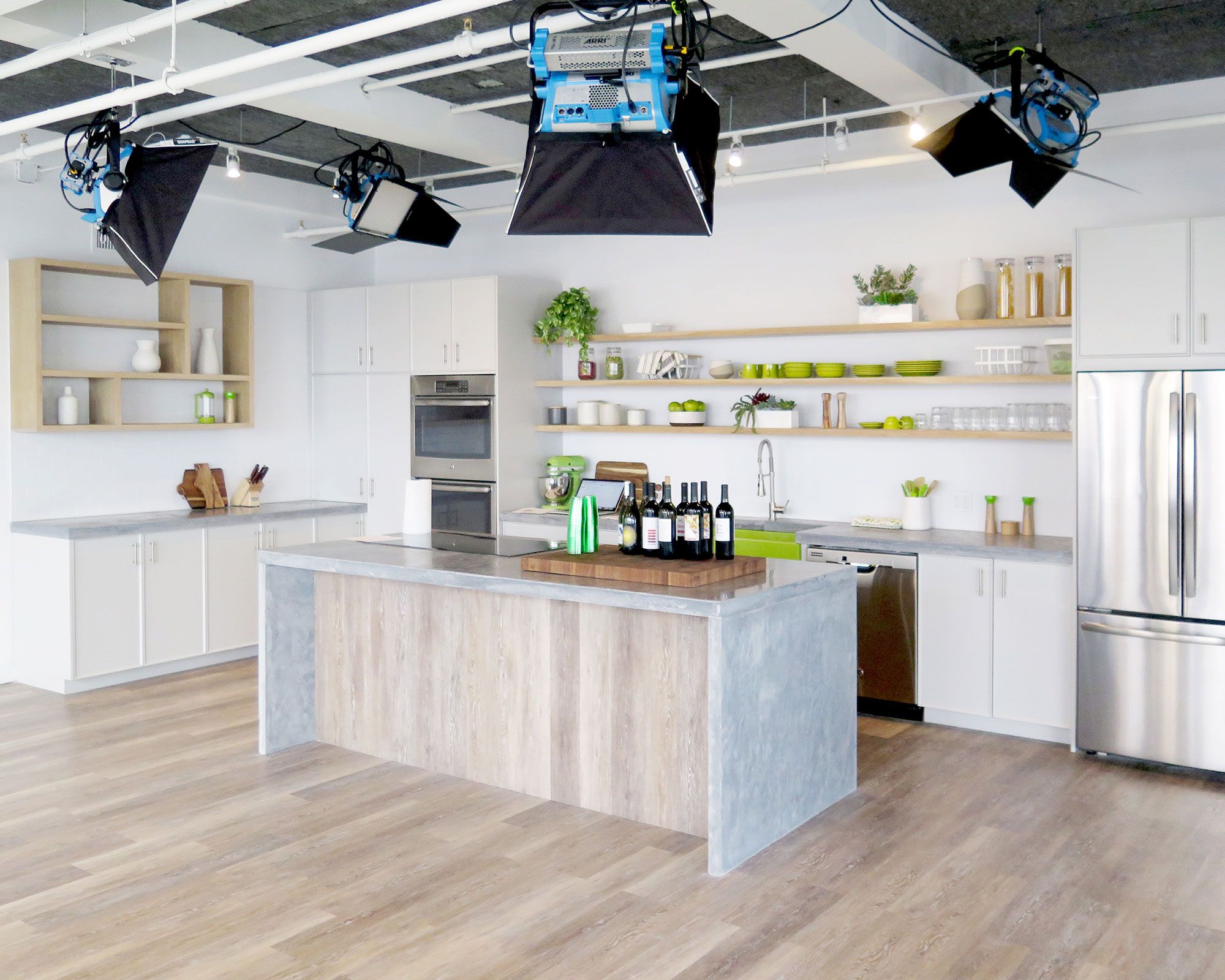
The fast-growing food company HelloFresh is in constant need for an array of digital and photographic assets for their ever evolving menu items.
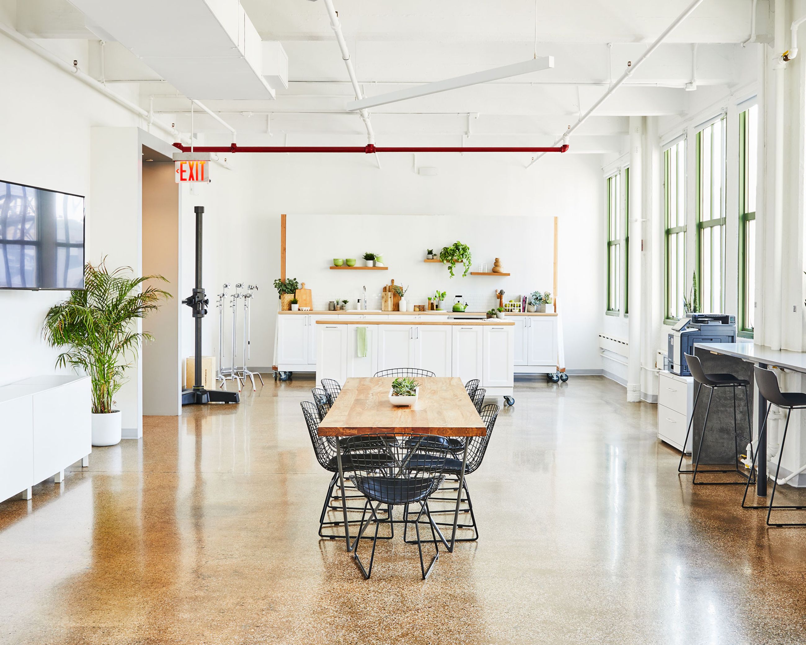
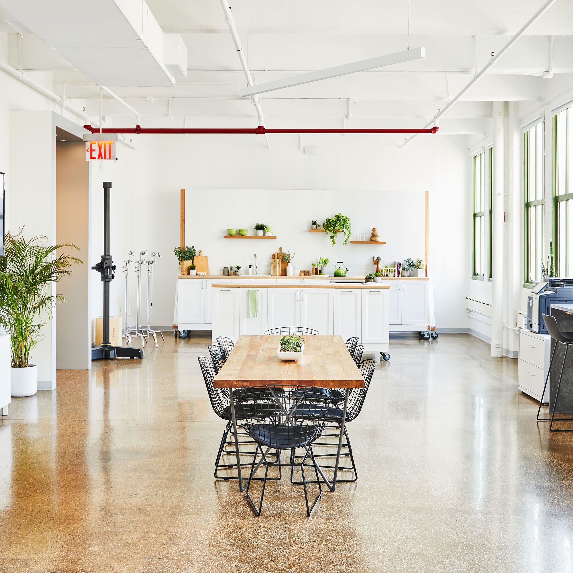
Method Design worked along side the in-house food and recipe team at HelloFresh, as well as both their head of marketing and art director to create a combined commercial test kitchen and photo studio. This complex mix of spaces required an intensive study of each group’s needs and daily routines. The result flawlessly stich together the operation, and obscures the overwhelming amounts of competing infrastructure required to run both departments in this dynamic, food centric organization.
In addition to the commercial test kitchen, (7) photo sets and (2) video bays were developed and built out to allow HelloFresh the ability to produce new product and document every detail along the way.
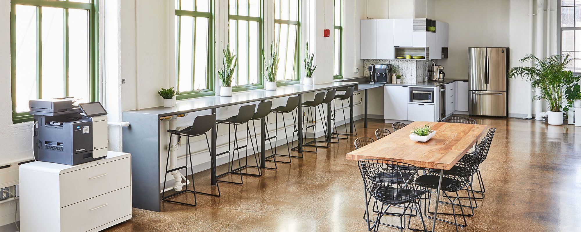
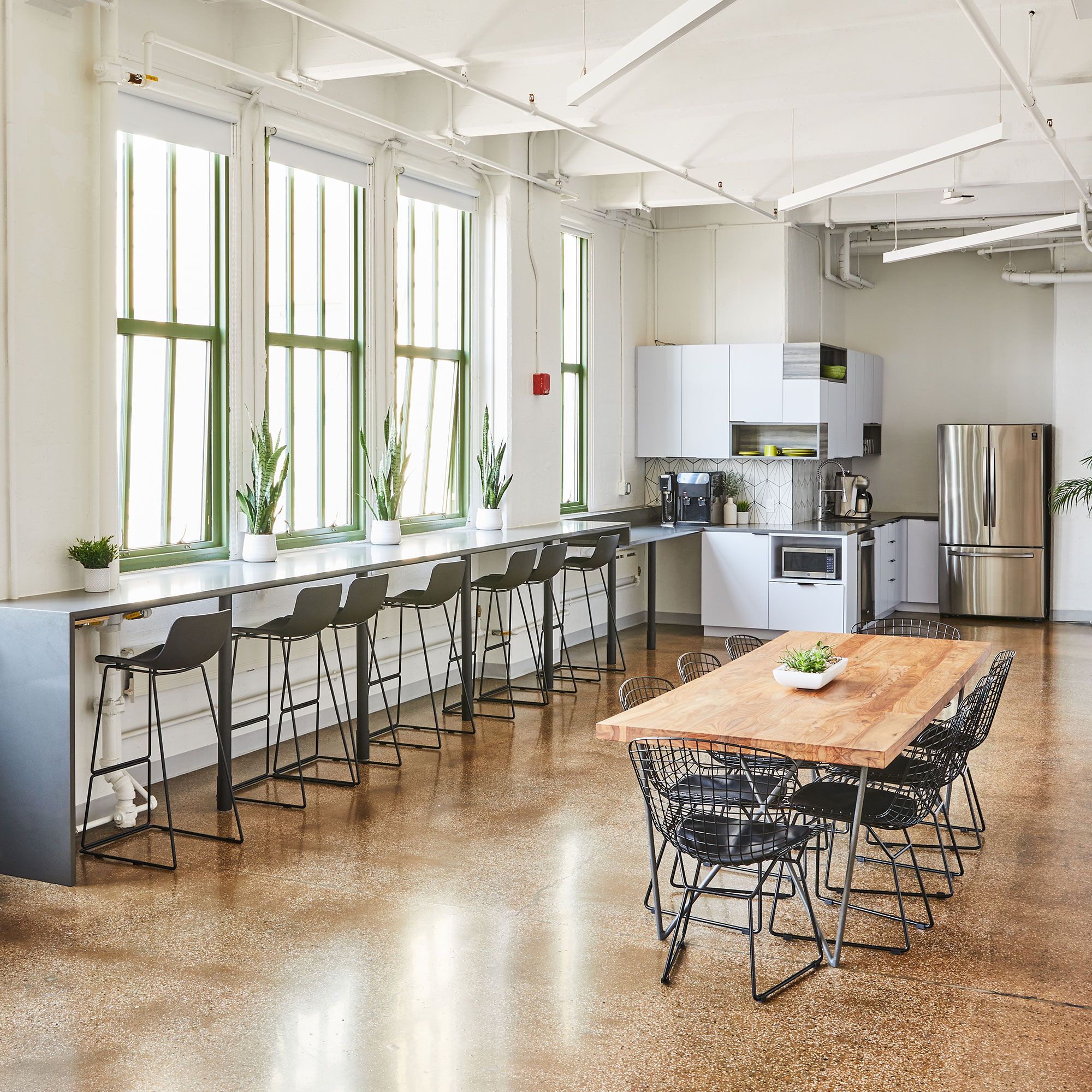
A complex mix of spaces flawlessly stitch together two departments and obscure competing infrastructures which run this dynamic, food-centric organization